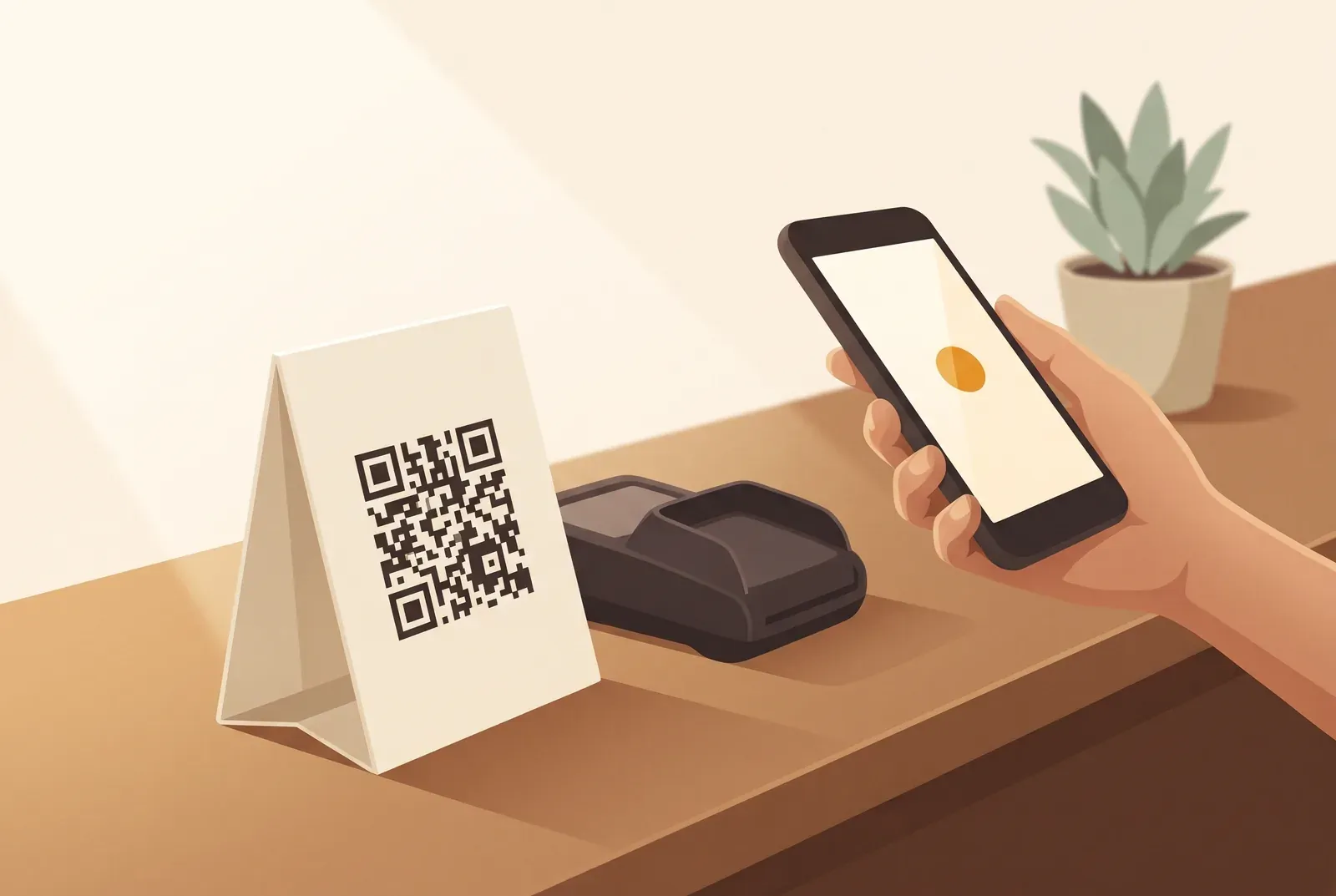
Your stamp card is set up, the reward is picked, the team knows the drill. And still, almost nobody scans. Nine times out of ten, that’s not a card problem. It’s a sign problem: wrong spot, too much text, or nobody ever mentions it. The QR code is the bridge between your program and your regulars’ phones. Put the bridge in the wrong place, and nobody crosses it. Here’s the full playbook.
Location decides: the counter, not the door
The most common spot is also the worst one: a sign in the shop window or right by the front door. Nobody scans there. People walking in are either in a hurry or busy finding their table, their friend, their bearings. There’s no quiet moment to pull out a phone.
That quiet moment happens exactly once per visit: while waiting at the counter. While the coffee’s being made, while the card gets tapped, while the people ahead pay, that’s when your regulars have a free hand, a phone already out, and a few idle seconds. That’s exactly where the QR code belongs. The rule of thumb: waiting time is scanning time. Put the sign where people already wait, and your scan rate climbs on its own.
For most shops, that means right next to the card reader, within arm’s reach, at phone height. At a salon or nail studio, it’s the reception desk where people pay and book the next appointment. At a food truck, it’s the pickup window. Wherever that small pause happens is where a scan becomes possible.
Format: small, sturdy, within reach
You don’t need a big display. If anything, a full A4 poster by the till reads as advertising and gets tuned out. What actually works is a compact counter stand in A6 or A5: big enough that the code is instantly recognizable, small enough to sit next to the card reader without taking over the space.
A few things that matter in practice:
- It has to stay put. An acrylic stand or a small wooden holder stays where you leave it, even when someone wipes down the counter. A loose sheet of paper ends up under the coffee tin within two days, and then nobody scans at all.
- Close enough to scan easily. The code should read clearly from 20 to 30 centimeters away. Phone cameras struggle with tiny or glossy codes; matte print beats glossy every time.
- A second sign rarely pays off. One good spot at the till beats five half-hearted ones around the shop. The exception is multiple tills, and then you want one at each.
None of this costs much. A basic acrylic stand runs a few euros, and you print the insert card yourself. You get the print-ready PDF for your card in the Treubar app. For the step-by-step, see “Print your QR code for the counter”.
What belongs on the sign, and what doesn’t
The biggest mistake is writing a novel. Nobody at the till reads three sentences. They decide in about a second whether it’s worth a second look, and then the moment’s gone. Your sign needs exactly two things: the payoff and the instruction.
The payoff is the reward, named specifically: “Your 10th coffee is on the house.” Not “Earn rewards,” not “Loyalty program,” because that says nothing. People collect toward something, so name the something.
The instruction is the one action to take right now: “Scan, tap ‘Add,’ done.” That kills the fear of hassle. No account, no app, no email, and you should say exactly that, because it’s the strongest objection-killer you have. Plenty of people hesitate to scan because they’re bracing for a signup ordeal. A small “no app, no signup” clears that right up.
A layout that works well for the insert card:
- Top: the reward, in large type (“10th coffee free”).
- Middle: the QR code, big and centered.
- Bottom: three or four words of instruction (“Scan on your phone, no app”).
That’s it. No logo clutter, no fine print, no little icon explaining what a QR code is. Less on the sign means more scans.
The one line your team says
A sign on its own might catch one guest in ten. The sign plus one line from your team catches a lot more. A silent stand gets overlooked; a spoken invitation doesn’t.
It has to be one line, always the same one, said in seconds, no pitch:
“Are you collecting stamps with us yet? One scan and the card’s on your phone.”
That’s an offer, not an ad. What matters is that everyone on the team actually knows it and uses it, including the Saturday temp. It helps if everyone adds a card themselves first; the line sticks better once you’ve done it. For more on introducing a program at the counter instead of on a poster, see our loyalty program guide for small businesses.
Common mistakes that kill the scan
We see the same four things over and over:
- Wrong spot. The code sits by the door or in the window instead of the till. Move it to where people actually wait.
- Too much text. The sign tries to explain the whole program. Cut it down to payoff plus instruction.
- No owner. Nobody on the team feels responsible, so the stand ends up behind the espresso machine. Name one person who keeps an eye on it.
- The line is missing. The sign is there, but nobody mentions it. Without the team line, you’re leaving half the effect on the table.
None of these mistakes cost money, just a bit of attention. And since the counter sign is the single point where your whole program succeeds or fails, that attention pays off more than almost anything else you could tweak.
Frequently asked questions
Where should I place the QR code for the best results?
Wherever your regulars already pause for a moment: at the till, right next to the card reader, or at the reception desk. Not by the door and not in the window, since nobody there is in a scanning mood. Waiting time is scanning time.
What format and material work best for a counter sign?
A compact stand in A6 or A5, sturdy and matte. A simple acrylic or wooden holder for a few euros is plenty; you print the insert card yourself. Big enough that the code scans cleanly from 20 to 30 centimeters away, since glossy or tiny finishes give phone cameras trouble.
What should I actually write on the sign so it doesn’t look like spam?
Two things, nothing more: the specific reward (“10th coffee free”) and the one action (“scan, add, done, no app”). No paragraphs, no fine print. The shorter and more specific it is, the less it reads as advertising and the more it reads as a real offer.
Is the sign enough on its own?
It helps, but your team is the real lever. A silent stand often gets overlooked; one line at the till (“Are you collecting stamps with us yet?”) multiplies the scans. The sign and the team line work as a pair.